Good lighting design turns a house into a home. It enhances the interior design and architecture, and should be designed to reflect how the resident lives in the space. A house can have the most beautiful interior design and stunning architecture, but if the lighting is wrong it simply won’t feel like a home.


Lighting affects how people feel about being in a space so it’s essential to get it right. To help with this we’ve put together some residential lighting design basics:
The lighting – both natural and artificial – should be considered from the start. The earlier it’s taken into account the more it will complement the interior design and architecture, and work to create the required ambience.
The key to great residential lighting is the quality of light and how it interplays with different surfaces. Because light itself is invisible a common mistake is to put too much emphasis on the hardware or design of a luminaire, above the quality of light that’s being emitted. For example, a chandelier might be chosen because it looks stylish, but how will it actually light a space? This needs to be considered.
Review the function of each individual space. Work out what surfaces should be seen and illuminated, and what composition is required at
different times of day. Don’t just flood a space with light.
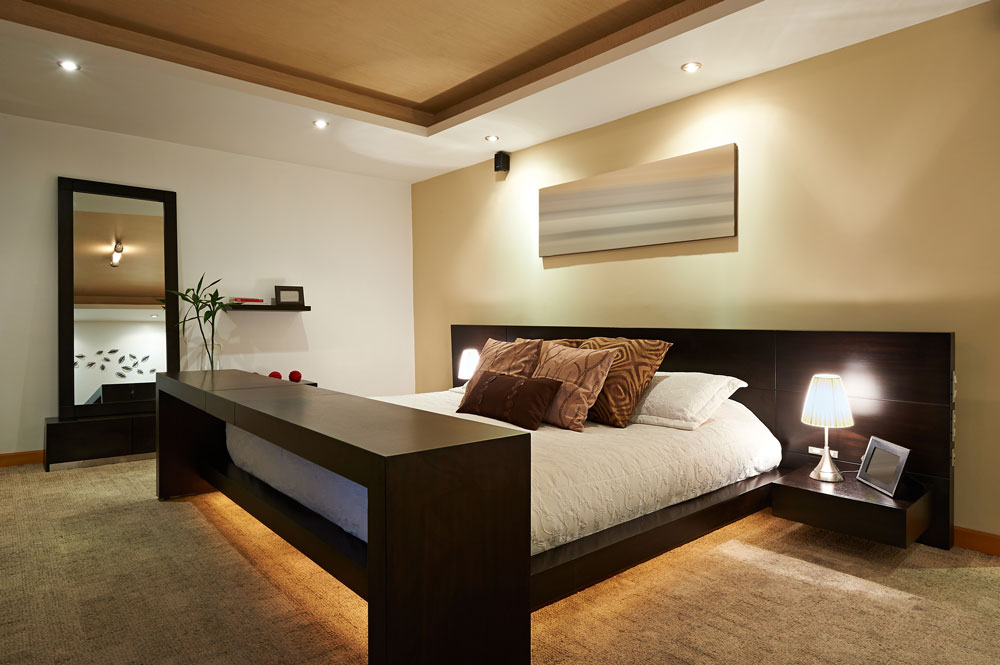
Avoid overloading a ceiling with downlights – they only illuminate the floor. By layering light with accent and feature lighting a minimal amount of downlights will be required and only where needed. Different layers of light include:
Ambient lighting – a base level of functional light (such as downlights)
Accent lighting – highlights key features and/ or details
Feature lighting – decorative pendants, table and floor lamps, wall lights etc.
Forming a composition with these layers of light, which includes contrast and drama, will create a cosy and comfortable, flexible and interesting home. Use different styles of lighting at various levels around rooms to create pockets of illumination and shade.
Always consider the colour temperature and colour rendering of a light source. Colour temperature is
measured in Kelvins (K) and indicates how visually ‘warm’ or ‘cool’ a light source will be – the lower the number the warmer the light. Candlelight is around 1500K, compared to 6500K, which is a cold light similar to daylight. Generally, residential lighting uses between 2500K – 3000K. The latest technologies include warm dim LEDs where the colour temperature reduces as the light output dims, much like traditional incandescent light sources.
The colour rendering of a light source measures its ability to accurately reproduce the colour of an object or surface. It’s known as the Colour Rendering Index (CRI) and light sources with a high CRI provide the most flattering and true light. The index runs from 0-100 and 90> is ideal.
For dual-purpose spaces consider circuiting and control systems to meet the required flexibility. By putting each layer of light on a separate lighting circuit/ switch different scenes and ambiences can be created.
Integrate lighting into joinery and architectural details for a subtle, stylish effect. Using these
‘concealed’ techniques creates invisible light sources, where the surfaces and objects themselves emit the light. Examples include:
Kitchens: lights under cupboards provide good task lighting that harmonises with overhead lighting. Always consider how and where shadows will fall (no one wants to chop their fingers off).
Bathrooms: integrated lighting (in mirrors, etc.) is particularly important because it produces a flattering light on skin. It’s not about illuminating the space, it’s about illuminating the face. Make sure light falls evenly between the face and a mirror and use a diffuse light for a flattering effect.
Wardrobes and cupboards: people want to see what they’re doing so integrating light into these areas creates a positive experience. A presence detector or micro-switch can automatically switch these on and off as required.
Walls:ensure they’re well illuminated, rather than the floor. Generally, if a space needs to feel light and bright, light the vertical surfaces – good vertical illumination decompresses a space. Whereas horizontal illumination, with minimal vertical illumination, compresses a space and makes it feel more intimate. At different times of day different ambiences might be needed.
Be cautious of mirrors (and other specular surfaces). They don’t necessarily make a space feel brighter – they only reflect what’s opposite. If a mirror is placed opposite a window the space will feel bright because soft lighting will come through the window. If a mirror is placed opposite a black wall, and a light is put above it, the space will feel twice as big but equally as gloomy. Sometimes a simple matt white emulsion can be a lighting designer’s best friend because it gives the most luminosity.
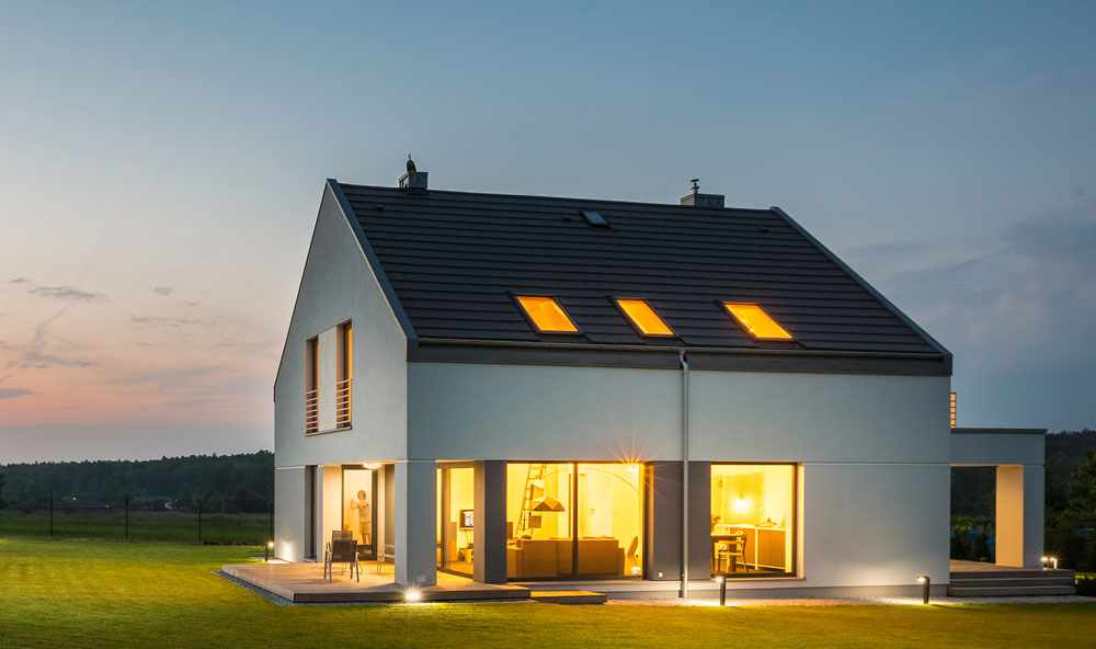
Garden or balcony lighting is as important as interior lighting. It draws the eye from the interior outside, expanding the feeling of space and making it not appear like a black mirror.
Lastly, with lighting products you get what you pay for. Spend money on good quality light sources
(such as LED lamps), not just the luminaire. Remember, when it comes to the very basics of residential lighting design, it’s about the quality of light and how it interplays with different surfaces.
